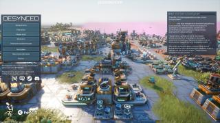
For now during playing of the Demo version, it was realy hard to undertand and..hmm..determine where is "Build" button, "Research" button and so on, all colors are seems kinda same "sky blue" color with slight difference. In general it would be good improvement to highlight buttons a little bit, and make them more intuitivly understandble for the user. If I skipped tutorial, it can be so confusing to understand where and what those buttons do :)
